Just a normal life
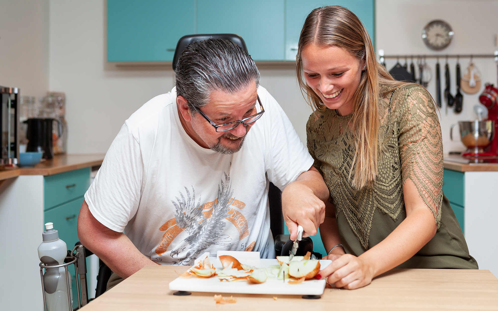
One organization, multiple locations and a lot of different people. How do we get unity, but leave enough flexibility so everyone can be who they are? It took some strategic sessions to develop the resulting clear focus: we communicate not ‘about’ clients, but ‘with’ clients. Raamwerk is of course a habitat and working environment centered in the society. And the people of Raamwerk just want to have a normal life*, sometimes with a bit of help.
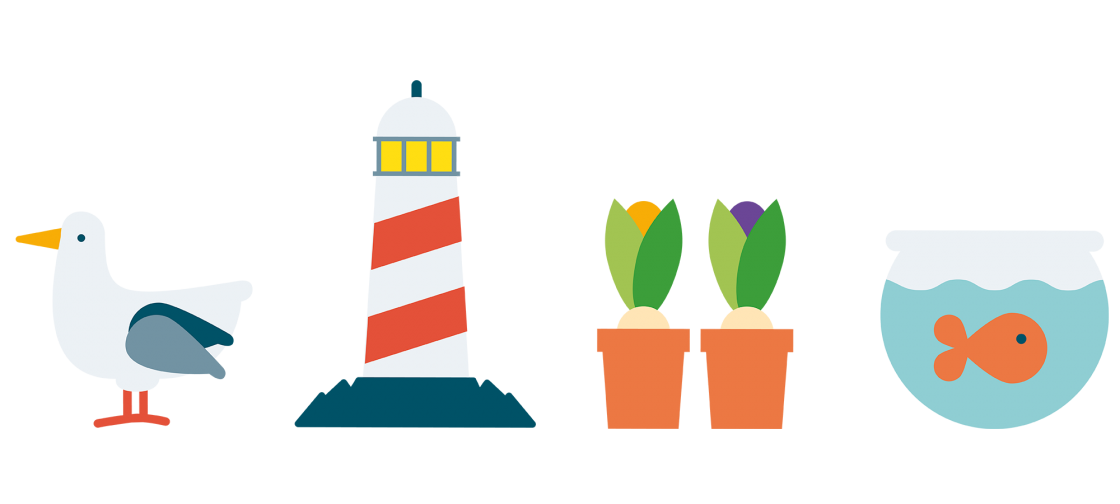
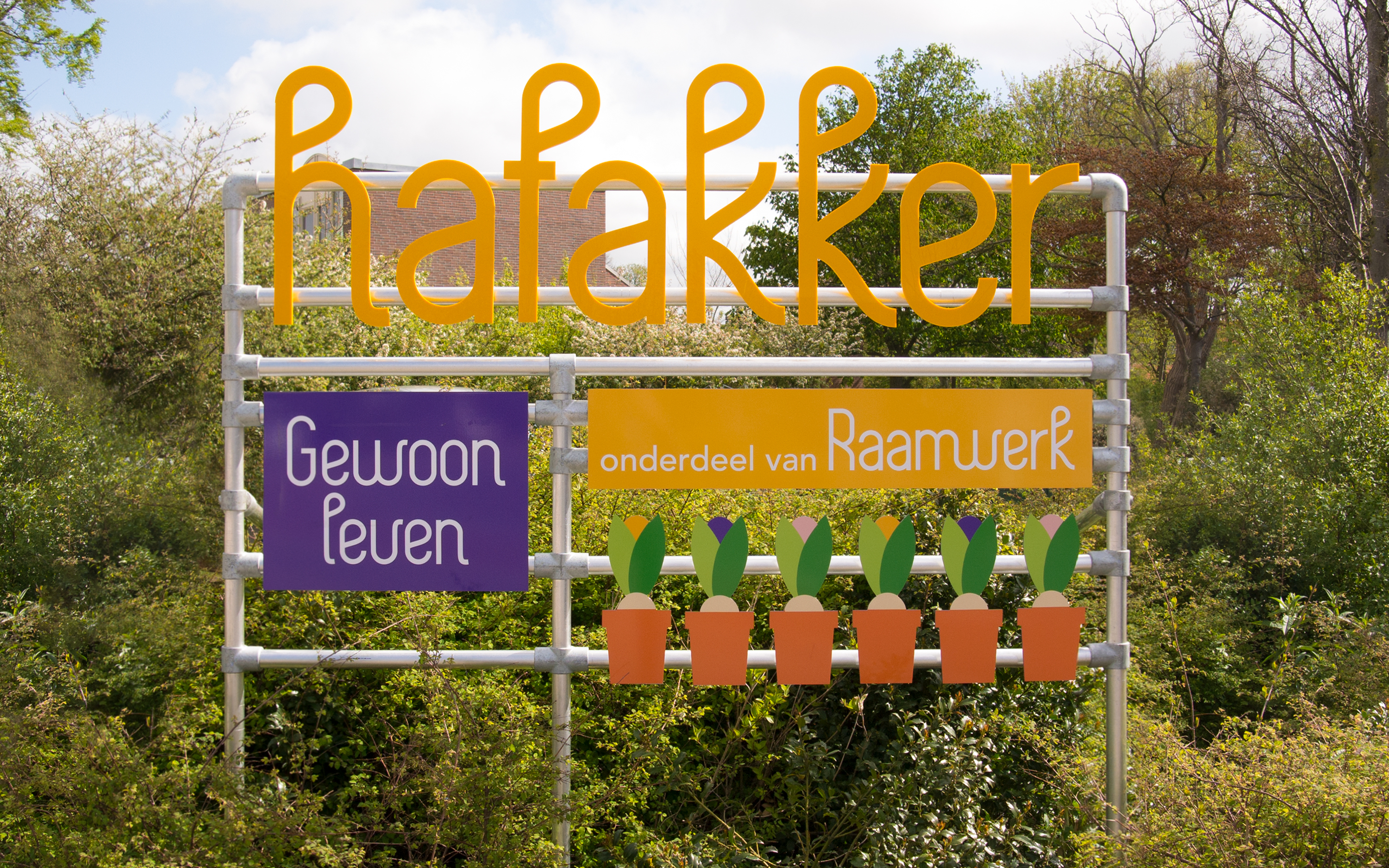
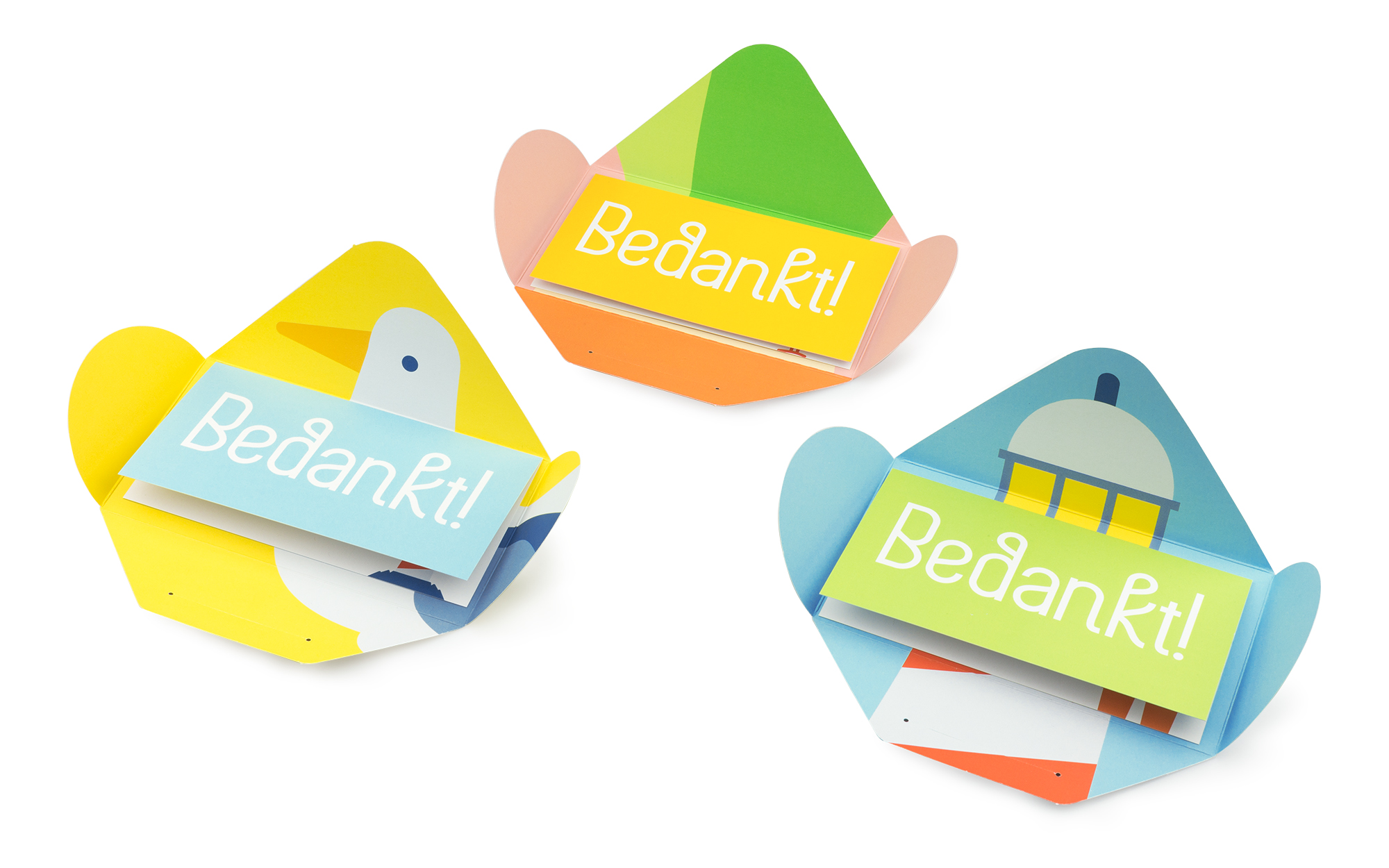
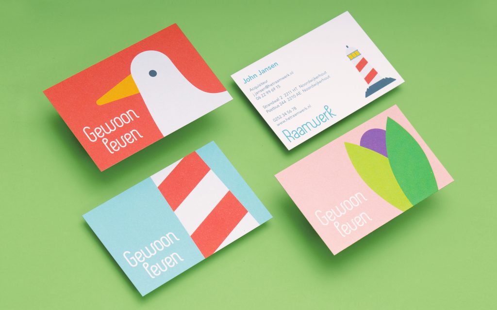
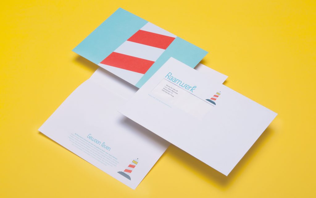
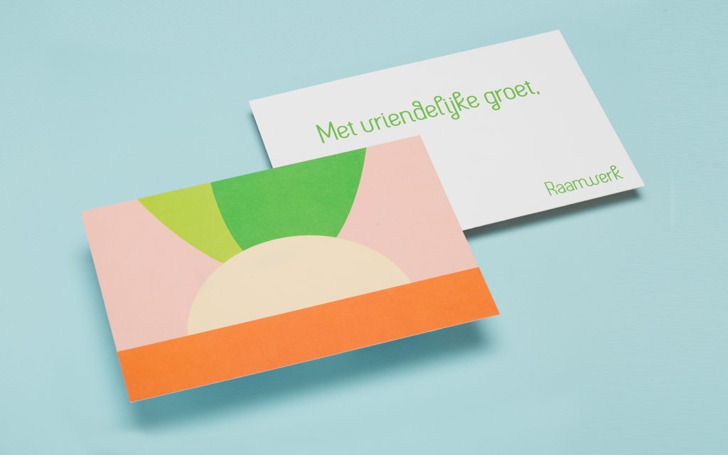
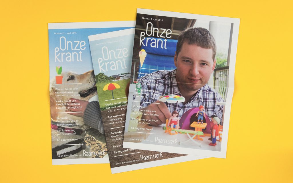
With this starting point RFT-O did not develop a logo, but its own, recognizable font. Together with a characteristic colour palette and appealing photography a unique style is created, which is innovative in the branch. And what about the people of Raamwerk? They choose and create their own style, but it always goes together for the unity.
“With this new visual identity Raamwerk becomes a lot more recognizable. Also our clients and contributors become very happy with this new appearance.”
Hans de Cocq van Delwijnen – Director Raamwerk
*‘At Raamwerk just a normal life means having self control over your own life, making your own choices, having rights and duties, being autonomous, having friends, the ability to develop yourself, the ability to contribute to society, leading a meaningful life. That is what Raamwerk knows as the quality of life. For people with a mental, physical, or multiple disability.’
Services
Brand strategy
Brand manifesto
Brand identity
In collaboration with
Hans Oostrum
Photography
