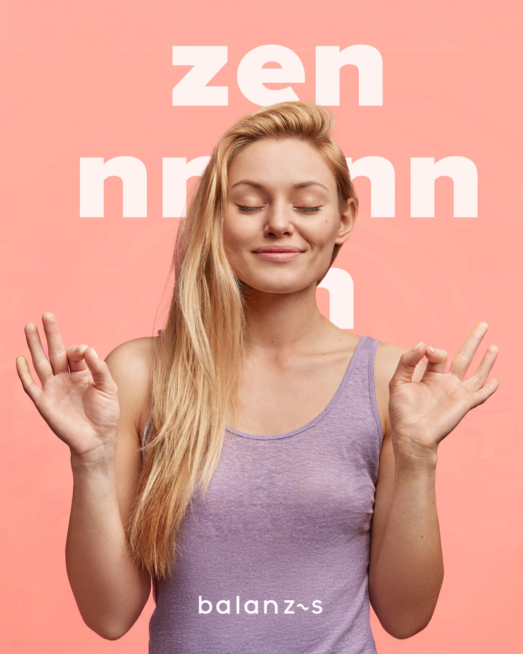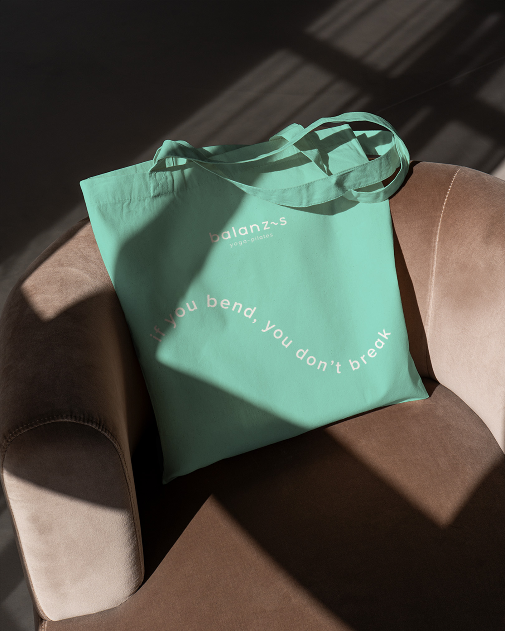
If you bend you don't break
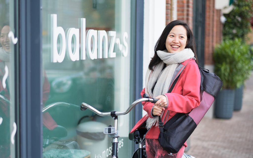
With locations in The Hague, Rotterdam, Amsterdam, and Utrecht, Balanzs helps you live a healthier life—without the struggle. Offering yoga, beauty treatments, massages, and retreats in a fresh, modern environment, Balanzs is on a mission to become the most fun and health-focused lifestyle brand in the Netherlands. Ambition is what drives us!
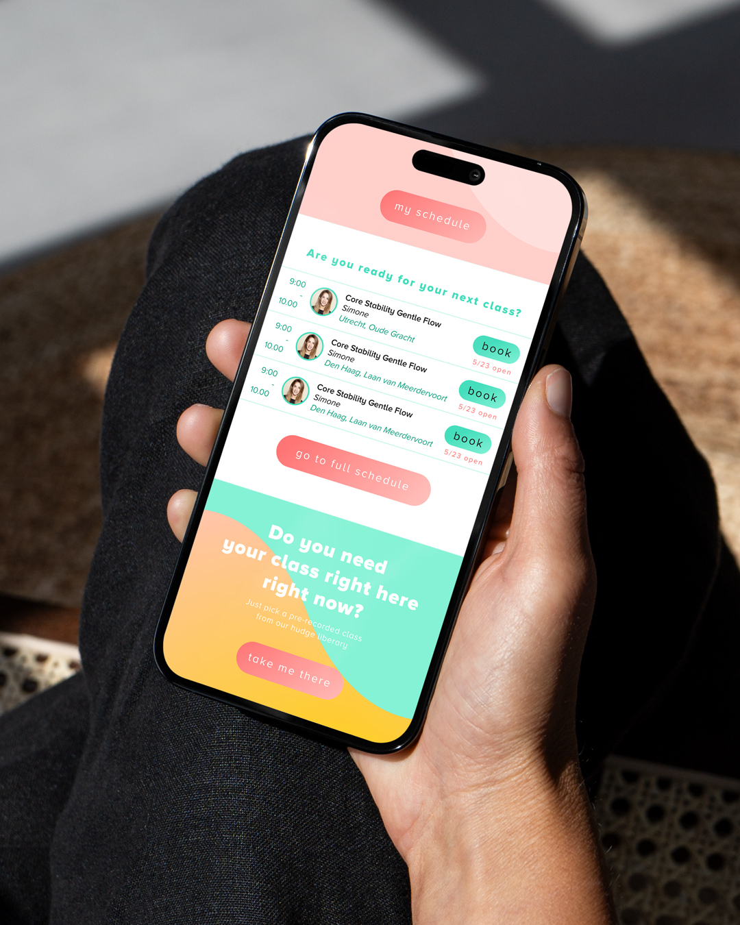
And when you have so much to offer, you want to keep your brand clear and consistent. That’s why RFT-O developed a solid, compelling foundation—one that aligns with Balanzs’ core values and provides a strong base for future growth. With this, Balanzs stands tall and confident.
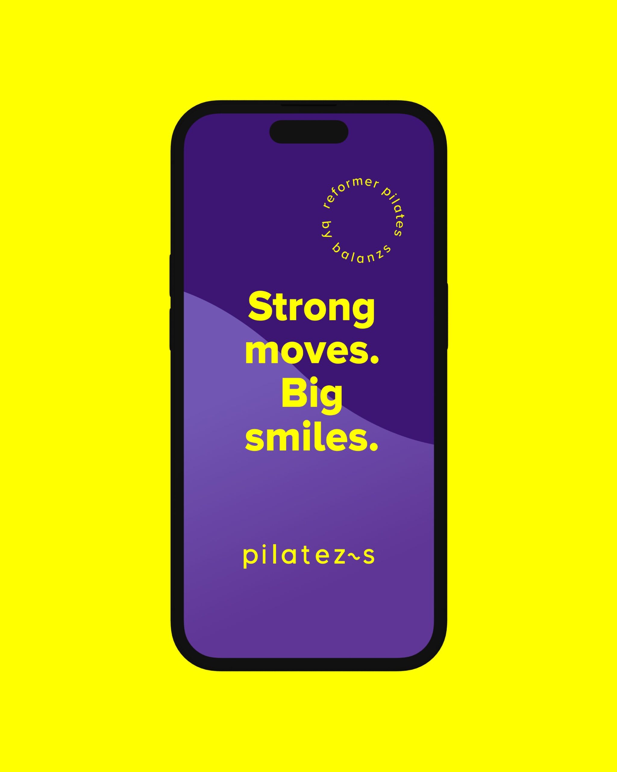
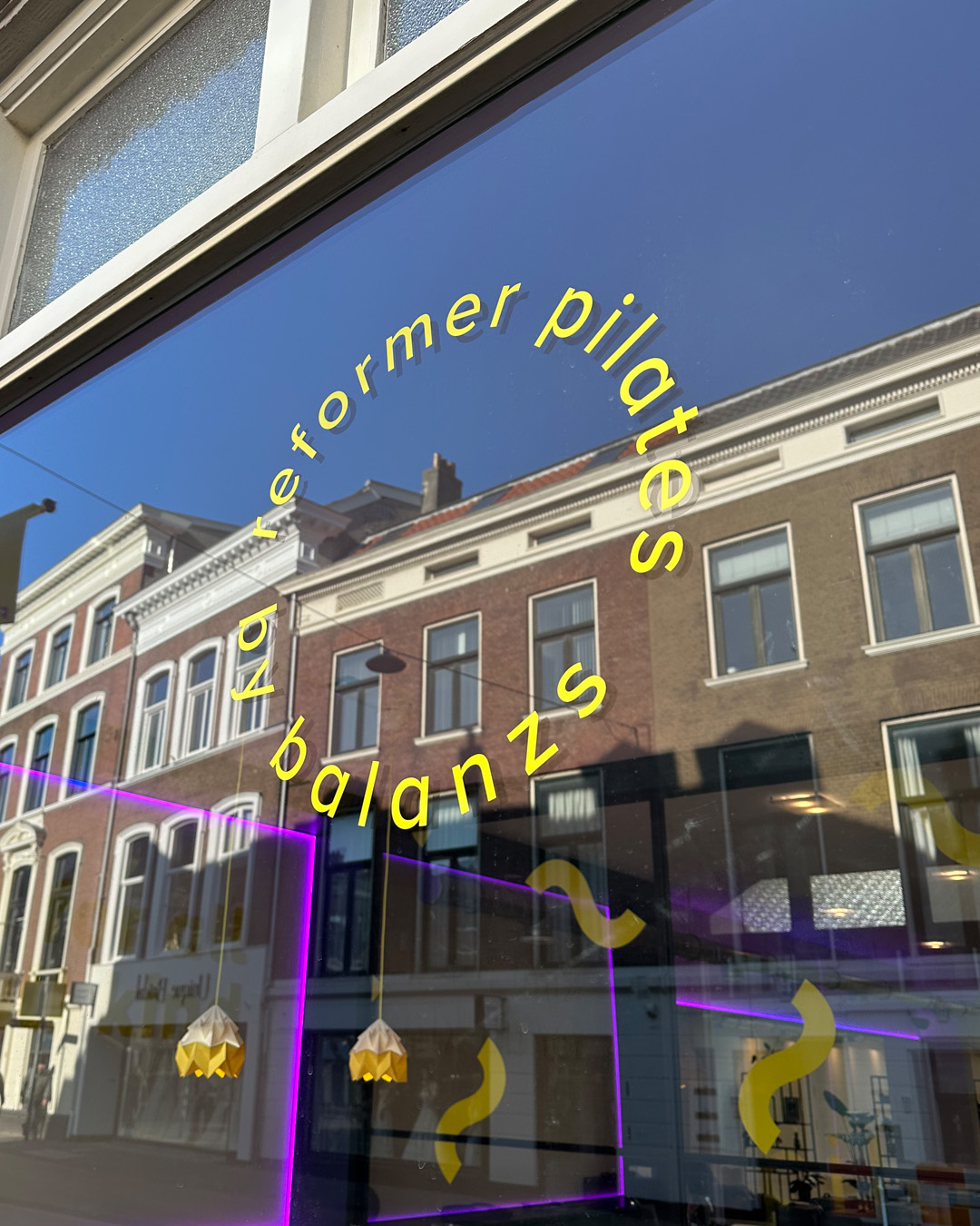
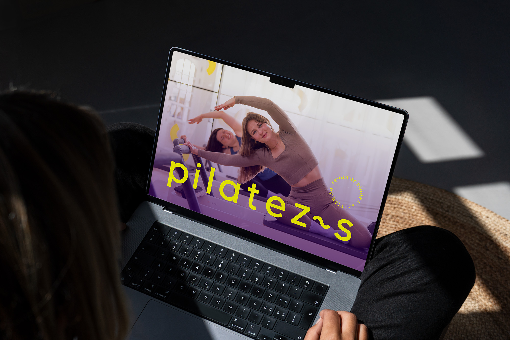
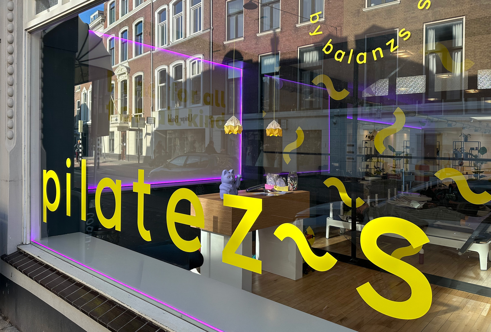
Strong enough to also grow into a successful pilates brand with multiple locations. The visual style for Pilatezs was developed from the Balanzs aesthetic—keeping key recognizable elements while introducing new ones that make Pilatezs unique. Fully in line with the Balanzs philosophy.
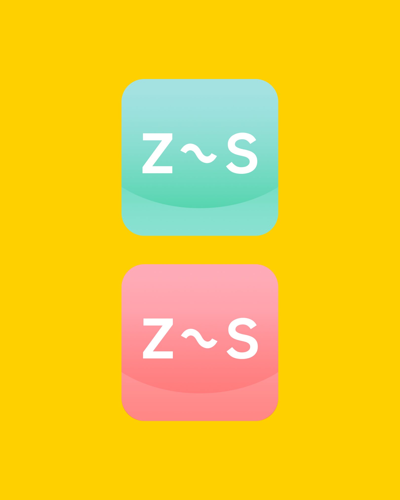
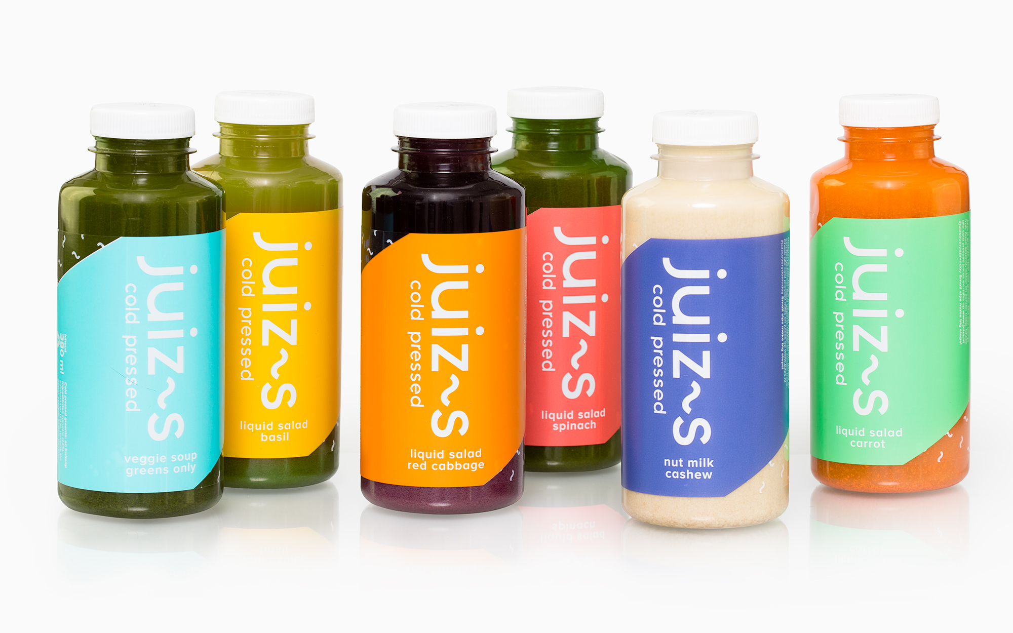
This same philosophy led to the creation of Juizs. Juizs is vegetables. A lot of vegetables. With just a little fruit. Cold-pressed, delicious, and free from unnecessary additives. It even says so on the label. And when you make a bold statement like that, your packaging should match. A vibrant bottle you want to be seen with—because you care about your body, but you’re not a boring celery root.
RFT-O developed a colorful brand identity and, based on that, the labels for the bottles—perfectly in line with the Balanzs style. A unique design that stands out on the shelves. No dancing grapes or walking bell peppers, just a pure, striking look. Complemented by strong copy that communicates the values of Juizs and Balanzs.
Services
Brand strategy
Brand identity
Short copy